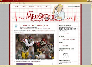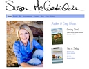
I just finished up a design for EWebscapes, this one is really neat! It’s From Medskool. “The journey to and through”.
The (student) doctor graphic is a custom illustration that I completed a couple of weeks ago – then wrapped this nifty design around it. I just love how the “O” is being squeezed by the blood pressure cuff. The whole layout just came together exactly as I saw it in my “artistic eye”. I love when that happens!


{11 Comments}
Great job Leanne!! As always you put that extra something into it!! :good:
Cool Leanne! Hugs, clara
Leanne, that is one great design I tell you.. so cute, and I also especially like the little trick with the BP cuff…. I am going to show that to one of our orthopedists here if he ever comes back from the OR. 😉
Sue
excellent job honey :good:
love ya
Great job as always! I just created a new blog for my pictures. No drawings for my header (can’t do what you do but wish I could) but I did take the picture and create the title! Check it out oh great one and tell me how I did!
http://fruitycapture.blogspot.com
:meow:
Wonderful job. How I envy those who are good in this websites and templates.
Thanks for passing by.
Love THIS!
I’ve been watching the progress on that drawing. Love the finished product!
I would like to take Leanne Lessons. Please? I’m not kidding. I can pay.
That looks so good! :good:
I’m sure he’s so pleased. Nice job. It really came together nicely!
I’m more than pleased. Thank you so much Leanne, I love it.
From Medskool
Sorry, comments are now closed.