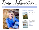
I know a few of you have been waiting for my new gallery layout to go live. Well it’s allllmost ready, so I’ve decided to show you and see how you like it!
There are a few more things that need tweaking, of course, it won’t go live until it’s all done. I’m going to work on it for a little while this afternoon as I wait for the mailmain to bring me that ONE piece of mail that will tell me if a jury thinks I’m any good, which for some reason always gets me in a tizzy.
Anyhoo, tell me what you think about that new setup! I’ll be in there doin’ stuff while you’re looking.


{5 Comments}
I definitly like the size of the font to go to the next page. Much better!!! I think it’ll be great over all!! xxoo tj
I really like the look and feel of the whole thing. The layout is easy to use and nice looking. The designs themselves are fabulous. All around good job.
I think having your comments next to the paintings add context… and is a good promotional strategy. Nice job.
I was just showing my assistant your work and you may soon have a new ‘client’! She loves your work. 😉 As do I. I wish I could see more of your photography though! Photography is my true love. 😀
Lily – I am in the process of uploading to the Photography category right now! Thanks for the reminder! I went through thousands of images and pick my favorite compositions, then resize them all. I’ll get through my 35MM photographs soon and add those too. Phew!
So have another peek, I’ll be working on those this morning! 🙂
Sorry, comments are now closed.