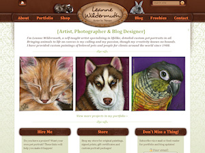
 For the past several weeks, I have poured nearly every moment of every day into a complete overhaul of intricateart.com. This is, after all, my bread n’ butter. I’d like to go over some of the changes for you and give you a quick run-down on the restructure of my site.
First, the geek speak. I’ve been running my site using 3 different installations of WordPress. This has been completely counter-productive, as each one had it’s own design and separate administrative areas. Not to mention separate databases, separate feeds, and separate plugins. What you’re seeing now is everything merged into one database (one GInormous database) and one design. I’ve used custom queries and code to create different looks for each section (category) of my site.
On to the design changes. I’ve made modifications to specific areas so that you’ll definitely know where you are as you move through my site and portfolio. Obviously the main page (screenshot above) stands alone. Three featured paintings, nice and big, direct you to my portfolio to browse through my work. Once you’re in my portfolio, here are the views:
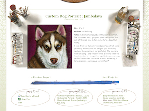
You might find it interesting to know that the art desk you’re looking at is, indeed, mine. I photographed it a few years ago and have finally had the opportunity to implement it into my design! I’m very excited about that!!
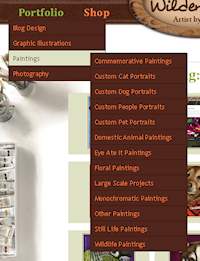
The portfolio, viewed 9 thumbnails at a time, can be easily navigated using the wonderful PageNavi plugin by Lester Chan. You can further narrow down which area in the portfolio you’d like to view using the New! Improved! drop down menu, just mouseover the Portfolio, drop down to “Paintings” and you’ll see all of the category options. Once you’ve arrived at a portrait you’d like to see details on, just click the thumbnail and you’ll get the full sized image with details, and can view or leave comments on my projects as well.
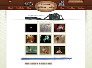 My Photography section is just a little different from my paintings, as I wanted to make a better distinction between my paintings and my photographs. Here, you’ll see my camera sitting atop the section instead of my workspace.
Another interesting note – for this part of my design, I photographed my camera with my camera. Want to know how I did that? I used a white background, set it on a white cabinet, and held a full length mirror in front of it after setting the timer. I simply mirrored the image to create this graphic. Neat, huh?
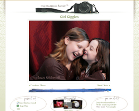 The single photos enlarge nicely and include navigation to browse directly within the category (my other portfolio categories work this way, as well). You have most of the same options here, to send the photo to a friend, share it on one of many social networking sites, the difference is here, instead of viewing similar photos, you can click right through to the photography prints in my shop to browse those prints available. Also, of course you can leave comments here as well. This is actually my old photoblog, merged into my old photography category – so there are both old and new photos here.
Okay. Moving on! Some neat things I’ve included in my design include a Site Map and Archive that allows you to get specific with the feeds you’d like to subscribe to. Have a look:
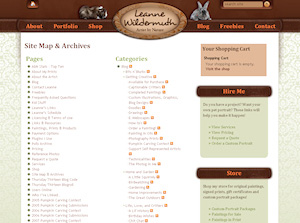
More stuff. Yes, there’s more stuff.
The navigation menu is now super intuitive. Things that were not so easy to find before are SUPER easy to find now. Pricing, prints, contact, quote, and everything you could possibly want to know about me and my artwork. It’s all there.
The blog, well, I kept some things from my old setup because I really liked that design. I just spiffied it up a little bit and added some really neat quotes up top to keep you on your toes. I cleaned up my “Bits n’ Blurbs” so they have their own look now, even when you view them all at once.

Using PayPal as my payment gateway, e-Commerce makes it really easy to set up shop. I’ve included Custom Portrait Packages, Original Paintings, Prints from Paintings, Photography Prints and also, new to my shop, I’ve added Gift Certificates. I’ll also be adding downloadable wallpapers and even prints to my Freebies page, so those will be up there shortly!
Overall, there are things you may notice now that you never knew were here before. This was truly a labor of love and long overdue! I hope that you enjoy the changes and, as always, I’m totally open to suggestions and feedback to make things even better for you.
Thank you ALL for being so patient with me during this transition!




{24 Comments}
I think it looks fabulous! (I desperately need a makeover on my blog, thanks for the reminder! How much do you charge?)
Absolutely fantastic!! :clapping: :yahoo: It looks wonderful, I know you worked hard and girl it paid off!! :thumbsup:
Breathtaking! I’m speechless. And green.
Man I wish I could afford you to design me a theme this is beyong fantastic! Brilliant! OMG I love it! btw which smiley plugin you using?
Jo – I’m using Custom Smilies 1.2 – here’s the link:
http://onetruebrace.com/2007/11/28/custom-smilies/
oooooooooooooooooooooo i love it!! :thumbsup:
Ooh, Leanne, I love it! :clapping:
I’m absolutely speechless Leanne. What a lovely job you’ve done – it’s wonderful!
I really like it! :clapping: :thumbsup: :dance:
WOW. can I hire you or something? And I love the signature font. Brilliant. :thumbsup:
I love ALL of it!!!! :clapping: :clapping:
And I can’t wait to see what wallpapers I can download! :dance:
Breathtaking… I love it!
love it… absolutely!
hmmm…
now i really think i need to hire your services…
This is really clean and fresh looking! I really like it – I still need to visit some areas, but I’m sure they’re also as cool as this!
:thumbsup:
Wow! You are amazing!
very nice! You did a great job 🙂
Yesterday (was it yesterday? or the day before?) I didn’t see the new blog section all rolled out. It’s great!
I’ve been playing around on the site and think I’ve finally come to the conclusion that I want to be you when I grow up. You’re amazing!
I love it! Simply amazing… :thumbsup: :clapping:
Love the new look! Awesome!
Nice! I’ve been fiddling around with redesigning my site and I like how you’ve transformed yours thru WP. I’m inspired.
Cool, Leanne! B) It looks so wonderful! I love it, I love it, I love it!
i’m not up on the techie stuff at all, but it visually looks great!
:yahoo: LOOKS FABULOUS AS USUAL FRUGGY! :yahoo:
Sorry, comments are now closed.