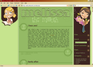
Melissa is a really great gal and a good read – so stop by and say hello, and be sure you add her to your blogroll.
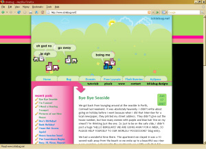
I finished up the week with this super sweet celebrity dog blog design, Celebrity Dog Watcher. This is an EWebscapes client project, so it will go into the EW Portfolio. (Speaking of which, I really need to get my latest stuff added to my own portfolio, huh?)
The CDW logo is super cool, I just love the artwork done by Pop Arf artist Nathan Janes. I used his brilliant color scheme to create additional graphics for the design and get everything flowing together. This is my first 4 column theme, and it really turned out cool, I think!
If you’re into the celeb scene (I try to be. I must admit.), Kym does a really great job dishing some totally informative celebrity doggy gossip. Definitely a great feed to add to the celebrity blog collection! Go have a visit!
I finished up another custom WordPress design today, this one for Kailani over at An Island Life. I have a little tweaking to do but overall it’s complete and so cute I just couldn’t wait to send you over to have a peek.
She basically requested a facelift on the design she had previously – separating posts, getting cute and creative in the comments, organizing and displaying her menu better. I threw my artistic touch into some custom graphics as well as a few stock images, updated her existing header, and the end result is a really fun summery beach theme. It was such a creatively inspired project, I had a lot of fun with it! Head over and toss her a beach ball!
Update: After I unbreak the search form. D’oh.
I added some custom templates and other fun plugins to make things really much more functional – these are really nice ones, if you’re looking to do something similar I highly recommend them:
A few custom graphics, and one purchased from iStock, and she’s ready to start photoblogging!
I love YAPB.
I am finally starting to catch up with my “to-do” list. Here are some things I’ve crossed off my list, and I still have to get visuals to go along with everything for you.
I still have some things to add to my list, too! I need to respond to some inquiries and add a photoblog design project, and I also need to find an hour to tell you about the wonderful experience I just had sending off my Great Blue Heron painting to his new home. The whole experience and sequence of events – beginning with meeting Laura – will leave you just as astonished as it did me. Divine intervention indeed.
I also need to tell you about my neighbor. This lovely woman we’ve lived next to for 11 years is not doing so well. I’ve been assisting her whenever she calls for help, and last weekend I waited with her as the ambulance came to take her to the hospice where she is now staying. She’s had trouble breathing for a couple of years, and initially when she was diagnosed they gave her 6 months. She’s well beyond that, but now she’s suffering and the pain she feels just from the effort it takes her to inhale and exhale breaks my heart. I’m going to cut some irises from her garden and take them to her today, and I’ll probably be saying goodbye. It’s very sad, but I’m glad that they are keeping her as comfortable as possible, she shouldn’t have to suffer through her final days. If you’d keep her in your thoughts and prayers, I know she would feel comforted knowing everyone wishes her peace. It seems odd, and I may even sound glib writing about her, but she’s honestly ready to pass on, she has been. She is tired of having to experience the pain of her body failing her before the Lord is ready to take her.
Mother’s Day, aaah Mother’s Day. What do you mom’s want for Mother’s Day? Me, I shared my secret with a friend, and I’m not going to spoil it here but wait patiently to see if my family knows me as well as they think they do.
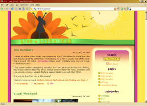
This was a fun design to do, I feel .. hungry when I go there. Yes. Hungry. For a big bowl of rainbow sherbet. There are worse things to feel when you visit a blog, right? heh.
Nancy is a doll, she’s so intuitive and sweet and wonderful. She’s also deep and thoughtful and intelligent – all of that comes out in her blog, and now I think we’ll be seeing even more of that as she finds her comfortable cozy spot among the bright sunshiny happy color scheme, and the sunflowers, too.
Her design was actually a real challenge, if you think about having a bowl of sherbet in front of you, if you stir it up too much it gets brown, eh? That’s not so good. I had to find that perfect balance, and then I had to figure out how to port an entire database from one server to another. WooHoo! All turned out well, and just opening her new spot will make you smile. So go on, just do it.
 I finished up a new design for EW last week – you can read more about the project here.
It’s grunge, masculine, industrial – it screams “guy blog”. Head on over to The Clay Show and see it live. 🙂
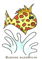
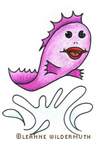
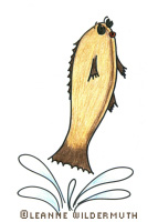
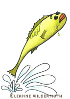
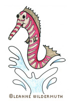
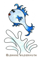
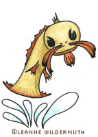
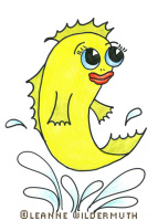
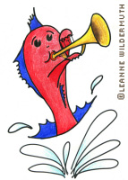
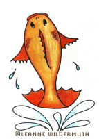
I had the most fun opportunity to illustrate a children’s book for a college student – without giving everything away, I’m sure my illustrations are a big hint to the storyline!
I started doodling late one night, refined my doodles into line drawings, then colored them in using colored pencil on a really smooth illustration paper – scanned them in and further enhanced them for print using Paint Shop Pro. I’m so tickled with the results, I just had to share.
Which little fishy is your favorite?